


Title Designer PABLO FERRO and ALLEN FERRO speak about the opening to Woman of Straw in this excerpt from our feature article Pablo Ferro: A Career Retrospective.
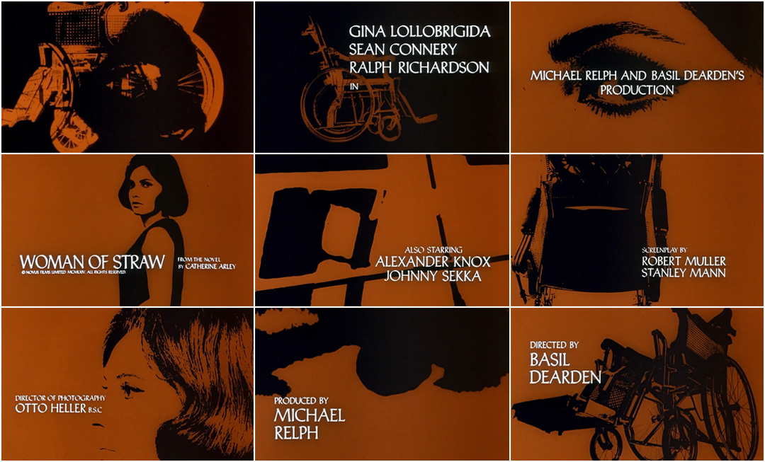
Pablo: When I was doing Strangelove I also did a title for another movie. A production designer asked me to work on Woman of Straw, with Gina Lollobrigida.
With that, I did a whole storyboard, showing high-contrast photographs of her, the wheelchair, Sean Connery, and a few other things. I shot that just like I shot [the commercial for] Burlington Mills but this moving was slower. We changed colour according to the music – Beethoven’s Ninth.
Pablo: They didn't like the colours so their version is all brown. My version is the only way that you could see it with the colour changing and the high contrast. I realized that it looked like Andy Warhol’s portraits. I said, “Maybe he saw this?” – but he couldn’t have seen it because it’s not even a movie.
Allen: No, but it had been at your apartment!
Pablo: I had a loft, and everyone came in there and that was an amazing thing. It was happening because of the work.

Woman of Straw storyboard in its original colour version, created by Pablo Ferro in 1963
Who were some of the people that visited?
Allen: The list is too long! Honestly. It was very strange back then. All manner of celebrity, all manner of business people.
Pablo: Everyone from Sal Mineo, Norman Jewison, Jon Voight...
Allen: A lot of artists. Peter Max.
Pablo: Warhol came over. Yoko Ono would come over and show her films, and they'd crack me up, they were very funny. It was very exciting.
Support Art of the TItle
Related
-
Pablo Ferro: A Career Retrospective, Part 1
feature interview
-
To Die For
title only
-
Agatha Christie's Poirot
summary
-
Lady in a Cage
summary
-
Bullitt
title only
-
Dial M for Murder
summary